Top 1%, across states
最富有的1%,州与州间的比较

Short-term update: this article has been fancied by some of the country’s most esteemed economists and featured in popular outlets such as Marginal Revolution (by a frequent NYT Upshot writer), supported by EconLog’s Arnold Kling, favorably tweeted by research head at Oxfam, and aknowledged by the Deans of three schools (one in public policy, and two in business). Within the first day generated >100 facebook shares, and >100 tweets, from various media here.
近期动态:本文深受本国一些声誉卓著的经济学家的喜爱,被“边际革命”等流行站点作为专题文章推荐。本文也得到了来自EconLog的Arnold Kling的大力支持,被乐施会的研究院领导热情转发,并得到三个学院(一个公共政策学院,两个商学院)院长的认可。本文发出第一天,就被这里的媒体在Facebook上分享100多次,在Twitter上推送100多次。
It’s an appealing chart from this week’s Economic Policy Institute’s report, leveraging the fashionable, French economist Piketty’s statistics, in order to illustrate how well the “top 1%” are doing in each of the 50 states. The report is provokingly titled: “The Increasingly Unequal States of America”.
经济政策研究所(EPI)本周的一份报告中,给出了一张富有吸引力的图表,引用了法国新潮的经济学家皮凯蒂的统计资料,用以说明“最富有的1%”在每个州过得有多滋润。这份报告有个煽动性的标题:美利坚大不平等国。
But the report creates distortions in the truth. An important matter affecting hundreds of millions should also include a straight acknowledgement of probability theory. We see through this article, that beyond the obvious national-level inequality (those at the top versus those at the bottom), targeting state-level differences in values is perverse. The latter is more a matter of probability theory, involving large sample sizes.
可是该报告扭曲了事实。做一件影响亿万人的事情显然应该考虑到概率论知识。通过本文,我们将会看到,越出全国层次上的显著不平等(顶层收入对底层收入)之外,而将焦点对准各州层次上的数值差异,是有悖常理的做法。在样本足够大的情况下,后者更多的只是一个概率问题。
Let’s start by looking at this chart below. It shows the differences in state-level ratios, contrasting the typical incomes at the top 1% versus the typical incomes at the bottom 1%【译注:原文如此,疑似99%之讹】:
让我们先从下表开始。该表显示了美国各州最富有的1%和其余99%的收入比率。
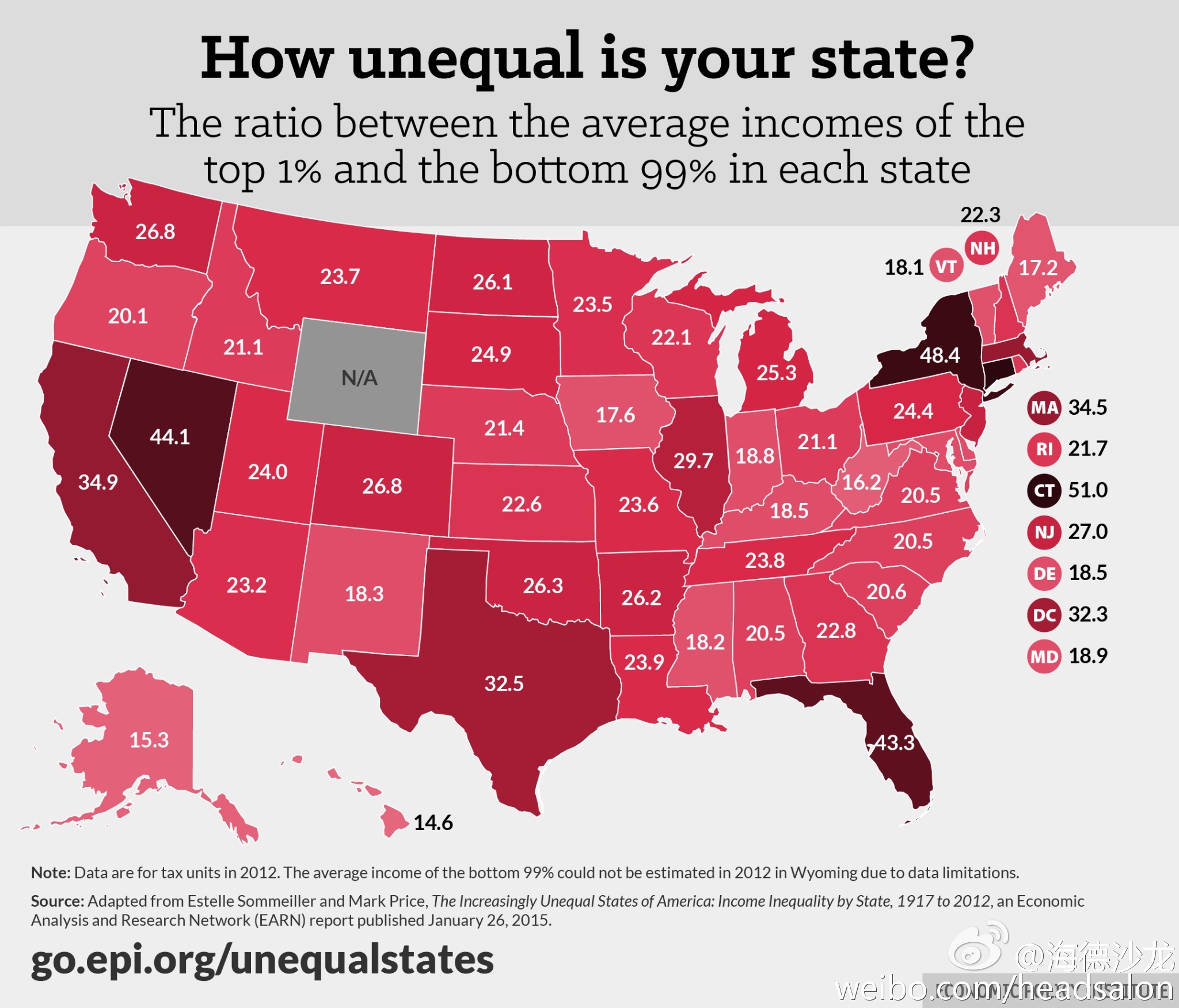
【插图-你所在的州有多不均等?最富的1%和其余99%的平均收入比率】
Everyone from the press, to news readers, gawk at how much each state’s levels are, in relation to the levels of other arbitrary states. But this is irrational. Are “liberal” states such as California and New York, twice as biased (or twice as unfair) as “conservative” states such of Arkansas and Maine?
无论是媒体业者还是新闻阅读者,都会被表中所见任意两个州之间的数字差异吓得目瞪口呆。但这是非理性的。难道加利福尼亚和纽约这样的“进步”州,真的比阿肯色和缅因这样的“保守”州贫富悬殊程度高两倍,或者说不公平程度高两倍吗?
Of course not. But that’s the poor logic one would convey from the former two states showing nearly twice the inequality values on the chart, versus the latter two states. Ex-post examination of living costs doesn’t fully explain things either, as expenses are generally higher in states such as Vermont, Alaska, and Hawaii, versus the expenses in states such as Texas, Illinois, and most of Appalachia.
当然不是。可按照表中数据,前两个州的不均等程度几乎是后两州的两倍,人们就很容易会得出这样简单的结论。即使把生活成本差异考虑在内,也不能完全解释上述现象,因为在诸如佛蒙特、阿拉斯加和夏威夷等州,生活成本通常还要高于德克萨斯、伊利诺斯和阿巴拉契亚地区的多数州。
This week I devoted a couple hours spelling out to a confused Wall Street Journal reporter how there is some pertinence here, related to probability theory. Population size theoretically impacts these statistics, and only a small number of these states are grossly unequal enough to warrant exhibiting them through a charming, 50-state map. Whenever we are forced to explore state-level analysis though, it should be done through the prism of simply explaining relative variation, well beyond what random luck would suggest.
本周,我花了几个小时向一位为此感到困惑的《华尔街日报》记者详细解释,为什么这件事和概率论有些关系。理论上,人口数量会影响这些统计数据,而仅有少数州的不均等程度会真的高到像这幅漂亮的50州地图中所显示的那样。然而当我们不得不在各州层次上做分析时,应该通过具有直白解释力的相对差异,而不是被随机巧合造成的结果所迷惑。
The most liberal people suggest that even thinking about this math is unnecessary. Perhaps any glorification of wrongs that need to be righted, justifies the means that it would take to get there. Over time this can conflate math ideas with one’s ideological bias. We must separate the discussion of national and structural inequality, among a population, from one where there is a perceived advantage for some groups relative to others.
最坚定的自由派认为根本没必要考虑这个数学问题。或许,那些有待纠正的错误,只是因为其结论被颂扬,得出这些结论所用的方法也就被认为是正当的了。长此以往,人们就会根据自己的意识形态偏见来选择性地理解运用数学概念了。我们必须将有关人口群体之间的全国性和结构性不均等的讨论,和大家所感觉到的部分人相对于其他人的优势区分开来。
We can’t prove the inappropriateness of inequality, by looking at the differences in relative inequality between states. We enjoy the right in the U.S. to pursue different outcomes. To take risks on the margins. We’ve been making many billions of these choices, across generations. This means that we always enjoy some separation in outcomes, particularly among the largest populations.
我们不能仅仅依据相对不均等程度在各州之间的差异,来证明不均等状况的不恰当性。在美国,我们享有追求不同成就的权利。为了利润,我们甘愿冒险,代复一代,我们的冒险决定价值数以十亿计。这说明我们总是乐于接受各人的回报有所差异,特别是在我们这么庞大的人口之中。
That’s how probability theory impacts all of our lives, even in “equal” conditions. We would prefer a safety net against hard times. Yet we will still take risks such as how much and what we learn, what we feed our bodies, what we do on vacation, what financial investments we accept, and when we plot a career change… the actions here can’t be deemed some unfair inequality. They are the mystical elements we call life!
所以即使是在完全“平等”的条件下,概率也会造成我们生活水平的差异。我们倾向于有一个安全网来渡过艰难时期。但是对于诸如学习什么、吃什么、如何度假、如何投资以及何时转换工作等等这些事情,我们仍然愿意承受风险。这些有差别的选择并不是不公平的。这些神秘元素,按我们的说法,恰恰就是生活!
In a divergent context, we will always see these interesting differences (based upon population size alone), in areas that have nothing to do with the topic of inequality. Such as the state-level distribution of newborn baby sizes, or the performance distributions of high-school athletes. We’ll mention others still later in this article. And all of this collectively confirms our understanding that there is something important to the probability math, explaining the relative dispersions connected to population sizes. All other hypotheses are secondary.
在一个千差万别的世界里,我们总能看到这些有趣的差异(样本总量够大就行了),哪怕在没有不平等的情况下也是如此。比如各州新生儿重量值分布,或者高中生的体育水平分布。后面我们还会提到其他例子。所有这些综合起来,支持了我们的这一观察发现:在这里所涉及的概率分析中,以人口规模解释相对离散度才是要点所在,所有其他假说都是次要的。
Before moving too far ahead, let’s first show that the Economic Policy Institute (EPI) chart above has a clear concordance between income dispersion and the population size itself. We’ll show this with simple arithmetic(!) as well, substituting for a complex probability area known as copula math (here, and here). If there were no connection between a state’s inequality calculations and the population rank, then how many states would be in the top 10 of both? What about in the bottom 10 of both? The answers are quite low:
(10⁄50)*(10⁄50)*50 = 2 states in the top 10 of both of both variables
(10⁄50)*(10⁄50)*50 = 2 states in the bottom 10 of both variables
在此问题上,首先让我们来证明,上述EPI的图表显示了,收入离差度(dispersion)和人口规模有着明确的一致性。我们将用简单的算术(!),来代替被称为关联结构(又称耦合)的复杂概率论数学方法。如果一个州的收入不均与其人口总量排名无关的话,有多少个州能在两项同时排前十名?又有多少个州能在两项同时排后十名呢?答案是:数量相当低。
\((10/50)*(10/50)*50 = 2\)个州同时在两项排名进入前十
\((10/50)*(10/50)*50 = 2\)个州同时在两项排名进入后十
So only 4 (2+2) states total. But it’s easy to certify from the chart that there is much more of a match among these variables than 4.
所以仅有四个州符合上述条件。但在上述EPI图表中,我们很容易找到多于4个州有这种配对关系。
Of the top 10 populated states, 5 were also among the top 10 “unequal” states: CA, TX, FL, NY, IL. Of the 10 least populated states, 4 were also among the 10 least “unequal” states: VT, AK, ME, HI. So instead of 4 overlapping states, we have a significantly higher 9 (5+4) states overlapping. Additionally, there are no crossover states (e.g., a highly “unequal” less-populated state, nor a less “unequal” highly-populated state). The easy math (9>4 with no crossovers) shows something, and it’s not structural inequality.
在人口最多的十个州里面,其中五个同样也在“不均等”程度最高的十个州里:加利福尼亚、得克萨斯、佛罗里达、纽约和伊利诺伊。在人口最少的十个州里面,有四个同样也跻身于“不均等”程度最低的十个州之列:佛蒙特、阿拉斯加、缅因和夏威夷。所以,重叠的州不止四个,而有九个之多。并且,没有交叉的州出现(例如“不均等”程度高且人口少,或“不均等”程度低且人口多)。简单的数学(9>4且没有交叉)确实说明了些什么,这不是结构性不平等。
The only common variable between the selection of the top 10 (and in the selection of the bottom 10) populated states is just population size itself! Does population size coerce inequality? Again, no. Otherwise we could just split California into two smaller states, making citizens suddenly feel there is somehow “greater equality”. Or we could reunite Virginia and West Virginia, making the new super-state’s citizens feel there is magically “greater inequality”. But this sort of statistical reasoning is crazy. It leads one to think inequality can be solved with scissors and glue.
在选择人口最多的10个州时(以及选择人口最少10个州时),唯一的共同变量就只是人口规模。难道人口规模大就催生不平等吗?也不是。否则,我们可以把加利福尼亚拆成两个较小的州,然后那里的居民不知怎么就突然感到更公平了。又或者我们把维吉尼亚和西维吉尼亚重新合并在一起,使得这个新超级大州的居民魔幻般地感觉到更不公平了。但这种统计推理是疯狂的,好像会使人以为不公平可以通过剪刀和胶水解决。
In our popular “Aristocrats in flyovers” article (a name suggesting easier state-level wealth in less-populated flyover states), we dig into the probability theory of extreme data. And there we continue to see this pattern show up repeatedly in diverse datasets and distribution types. Such as the wealthiest individual per state, or the number of cumulative Miss America winners per state. Again this couldn’t be coincidence, and we can also mathematically solve for the theoretical expected values for parametric most extreme individual, as we did in this article here.
在我们颇受欢迎的文章《内陆州的贵族》(标题暗示了在较少人口的内陆州里较易达到州内顶级财富水平【译注:原文这句话意思不太清楚,不过从所引文章内容看,好像是这个意思】)中,我们深入探讨了有关极端数据的概率论。我们能够看到这种模式在多样化的数据集和分布类型中不断出现。比如每个州最富有的人,或是每个州的美国小姐累计人数。这也不可能是巧合,我们可以在数学上解出对于极端个体参数的理论期望值,就像我们在这篇文章里做的那样。
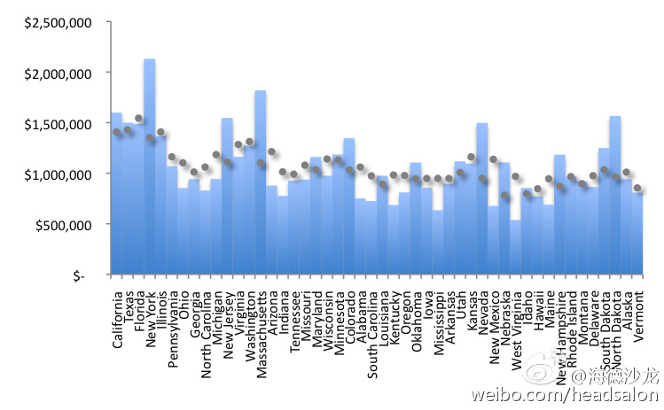
Take a look at the bar chart below (of the top 1% income), and see in dots how tight the trend is for relative inequality, versus state population. We would theoretically calculate that the more populated states to have considerably higher top 1% income (a double-digit percent increase!), versus the top 1% income in the less populated states- and this relates to the EPI chart above. Connecticut was the single, unreliable outlier removed, using a parallel statistical process others also do (notice Wyoming is missing in the aforementioned chart.)
从下面(有关最富的1%)的柱状图我们可以看到,各州的相对不均等水平与其人口规模之间的联系相当紧密。我们能从理论上计算出,人口大州相对于人口小州来说,其最富的1%的收入也明显较高(两位数百分点的提高!),这与上述EPI图表密切相关。康涅狄格州是唯一的例外,当使用其他州同样使用的平行统计处理时,显示为异常样本,所以被剔除了(注意怀俄明州不在上述图表中)。
 We also show a related transformed bar chart, below, instead fixating on changes in the the relative standard confidence interval (as one moves across the chart from the less populated states, to the most populated states). We can now confirm that we mustn’t ignore probability modeling as part of this story. We can’t persistently pretend that less-progressively larger (a generally concave inequality dispersion function, similar to how it is with most economic data) inequality doesn’t exist, for the most populated states.
我们还在下面做了一张与此相关但经过整理的图表,在表中我们将各州按人口规模排序,固定标准置信区间的相对变化。于是我们可以确信不能忽略概率模型在此问题上的作用了。对于人口大州来说,我们再也不能假装逐渐变大(一个大致凹形的不均等分布函数,与其他经济数据类似)的不均等不存在。
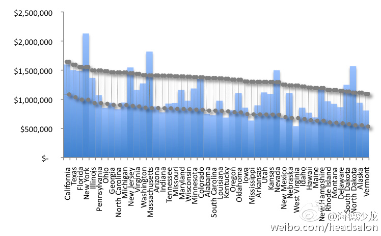 Don’t assume -as many lay people and activists do- that these are sampling errors that must vanish, as the sample population sprouts into the millions. This would be deceitful and cause most people to further jump on top of similar “research” as the EPI chart, falsely connecting most of the state-level calculation differences to genuine differences in inequality.
不要像很多外行人和活动家那样,以为这些只是因为样本太小带来的错误结果,然后随着样本大小增加到百万级后就会消失。这个设想是欺骗性的,而且将令大多数人追随EPI图表之类的“研究”结果,错误的把按州计算的差异同真正的不均等差异联系起来。
The conclusions of this article are again as pertinent for the top 1% in a population, as it is for the most extreme person in any group. This is since the top 1% is still extreme enough along the probability distribution (from 0%, to 100%), so that larger populations will lead to less-progressively larger, top percentile thresholds. Of course this is not true for sampling (Ch.5 in Statistics Topics) closer to the middle of a peer distribution (e.g., top 49%, or bottom 49%), where most of us in society have performed through the ages.
本文的结论不仅适用于人口中最富有的1%,也同样适用于任何群体中的极端个体。从概率分布(从0%到100%)的角度来讲,最富有的1%已经足够极端,所以人口数量越大,在顶端部分的跳升就会越不渐进。当然,当取样规模(《统计问题》第五章)接近整体的中间位置时(例如最高的49%,或者最低的49%),结论就不一样了,自古以来我们当中的大多数人都在这一阶层里。
翻译:一声叹息
校对:小册子(@昵称被抢的小册子)
编辑:辉格@whigzhou